In my last post I talked about how and why I used Google Sheets as the backend and database for the Aspire Budget apps. When I wrote that post, I had just launched version 1.0 of the app which has received some great response. However, if you did download the app, you would notice that the user interface of the app is really not appealing.
Since I have decided to redo the user interface entirely, in this blog post I will write about building the TabBarView that will be used in v2.0 of the app.
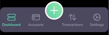
Before we begin, this is what we are going to build:
Setting up Light and Dark Mode
As you see in the gif above, the TabBarView supports both light and dark mode. To do this we will set up our color scheme first.
I’m going to add a “New Color Set” to my Assets.xcassets and call it tabBarColor and set the “Appearances” to “Any, Dark” and set the “Dark Appearance” to #302E44.
In addition to this, I will add two more color sets, one for the tab bar item default tint color and one for the tab bar item selected tint color.
Creating Extensions
The color set created above will be referenced in code and to ensure our TabBarView is not littered with string literals, I will create an extension on Color and add tabBarColor, tabBarItemDefaultTintColor and tabBarItemSelectedTintColor as static properties.
In addition to colors, we are also using a custom font which is retrieved by a static function added as an extension to Font.
Note: To add a custom font to your project, add the .ttf file to your project, add “Fonts provided by application” entry to your Info.plist and add the full name of the font, in our case “Nunito-Bold.ttf” as a child element to the newly added key.
extension Color {
  static let tabBarColor = Color("tabBarColor")

  static let tabBarItemDefaultTintColor = Color("tabBarItemDefaultTintColor")

  static let tabBarItemSelectedTintColor = Color("tabBarItemSelectedTintColor")
}

extension Font {
  static func nunitoBold(size: Double) -> Font {
    return Font.custom("Nunito-Bold", size: CGFloat(size))
  }
}
Creating a TabBarItem
The TabBarView we are creating follows a strict requirement that there should be four regular TabBarItemViewss and one prominent call to action button. Each of the four regular items is an image and a title, which we will wrap in a struct called TabBarItem.
struct TabBarItem {
  let imageName: String
  let title: String
}
Creating a TabBarItemView
At the surface, a TabBarItemView is just displaying an image and a title. But internally, a TabBarItemView needs to keep track of whether or not it is selcted and also manage the the selection tint color.
struct TabBarItemView: View {
  let tabBarItem: TabBarItem

  let selectedIndex: Int
  let tabBarIndex: Int

  let defaultColor: Color
  let selectedColor: Color

  let font : Font

  private var displayColor: Color {
    selected ? selectedColor : defaultColor
  }

  private var selected: Bool {
    selectedIndex == tabBarIndex
  }

  var body: some View {
    VStack {
      Image(systemName: tabBarItem.imageName)
        .resizable()
        .foregroundColor(displayColor)
        .aspectRatio(contentMode: .fit)
        .frame(width: 30, height: 30)
      Text(tabBarItem.title)
        .font(font)
        .foregroundColor(displayColor)
        .frame(height: 10)
    }
  }
}
Creating the Prominent Call to Action button
This call to action button is a round button with a gradient background and an image. It also needs an action closure that takes no parameters ands returns Void.
struct ProminentTabBarItemView: View {

  var width: CGFloat = 70

  private var innerCircleWidth: CGFloat {
    return width - 10
  }

  private var imageWidth: CGFloat {
    return innerCircleWidth / 2
  }

  private var gradient: LinearGradient {
    let endColor = Color(red: 0.495, green: 0.945, blue: 0.571)

    let startColor = Color(red: 0.176, green: 0.784, blue: 0.59)

    let gradient = Gradient(colors: [startColor, endColor])

    return LinearGradient(gradient: gradient, startPoint: .bottomLeading, endPoint: .topTrailing)
  }

  let systemImageName: String
  let action: () -> Void


  var body: some View {
    Button (action: action) {
      ZStack() {
        Circle()
          .size(CGSize(width: width, height: width))
          .foregroundColor(.white)

        Circle()
          .size(CGSize(width: innerCircleWidth, height: innerCircleWidth))
          .fill(gradient)
          .offset(x: 5, y: 5)

        Image(systemName: systemImageName)
          .resizable()
          .frame(width: imageWidth, height: imageWidth)
          .foregroundColor(.white)
      }.frame(width: width, height: width)
    }
  }
}
Creating the Container Box
The TabBarView is contained in a rounded rectangle with the fill color of this dependant on the the colorScheme keypath of the environment
  private var containerBox: some View {
    Rectangle()
      .fill(Color.tabBarColor)
      .cornerRadius(cornerRadius)
      .frame(height: height)
      .shadow(radius: shadowRadius)
  }
Laying out the TabBarItems
The four TabBarItems are going to be placed in the containerBox we just created. I’m going to use a GeometryReader to calculate the width of each item to ensure they’re all evenly placed in the container.
The total width for each item is calculated by:
itemWidth = (screenWidth - prominentItemWidth) / 4
  private var tabBarItemsView: some View {
    GeometryReader { geo in
      HStack {
        ForEach(0..<2) { idx in
          TabBarItemView(tabBarItem: self.tabBarItems[idx],
                         selectedIndex: self.selectedIndex,
                         tabBarIndex: idx,
                         defaultColor: .tabBarItemDefaultTintColor,
                         selectedColor: .tabBarItemSelectedTintColor,
                         font: .nunitoBold(size: 14))
            .frame(width: self.tabBarItemWidth(from: geo))
            .onTapGesture {
              self.selectedIndex = idx
          }
        }

        Spacer()

        ForEach(2..<self.tabBarItems.count) { idx in
          TabBarItemView(tabBarItem: self.tabBarItems[idx],
                         selectedIndex: self.selectedIndex,
                         tabBarIndex: idx,
                         defaultColor: .tabBarItemDefaultTintColor,
                         selectedColor: .tabBarItemSelectedTintColor,
                         font: .nunitoBold(size: 14))
            .frame(width: self.tabBarItemWidth(from: geo))
            .onTapGesture {
              self.selectedIndex = idx
          }
        }
      }
    }
  }
Putting it all together
Finally, the containerBox, prominentItemView and tabBarItemsView are put together in a ZStack to build the final TabBarView.
struct TabBarView: View {

  private let cornerRadius: CGFloat = 16
  private let height: CGFloat = 95
  private let shadowRadius: CGFloat = 16

  private let prominentItemWidth: CGFloat = 70

  private var prominentItemTopPadding: CGFloat {
    return -prominentItemWidth
  }

  let tabBarItems: [TabBarItem]
  let prominentItemImageName: String
  let prominentItemAction: () -> Void

  @State var selectedIndex = 0

  var body: some View {
    ZStack {
      containerBox
      prominentItemView
      tabBarItemsView
    }
  }
}
The source Code for this component is available in my SwiftUITutorials repository on Github.